Strong energy – made easy . 2011/12


STAWAG
The Stadtwerke Aachen AG is a service provider for electricity, gas, heat and water in Aachen.
Tasks
Making all aspects of energy and water supply as simple as possible for the customer, thus adding ease to life was the starting point for the relaunch of the STAWAG brand.


Strong energy – made easy
Design idea
Einfach machen (make something simple and just do it)
Brand codes
The new brand experience shows the positioning in a striking, concise and friendly way:
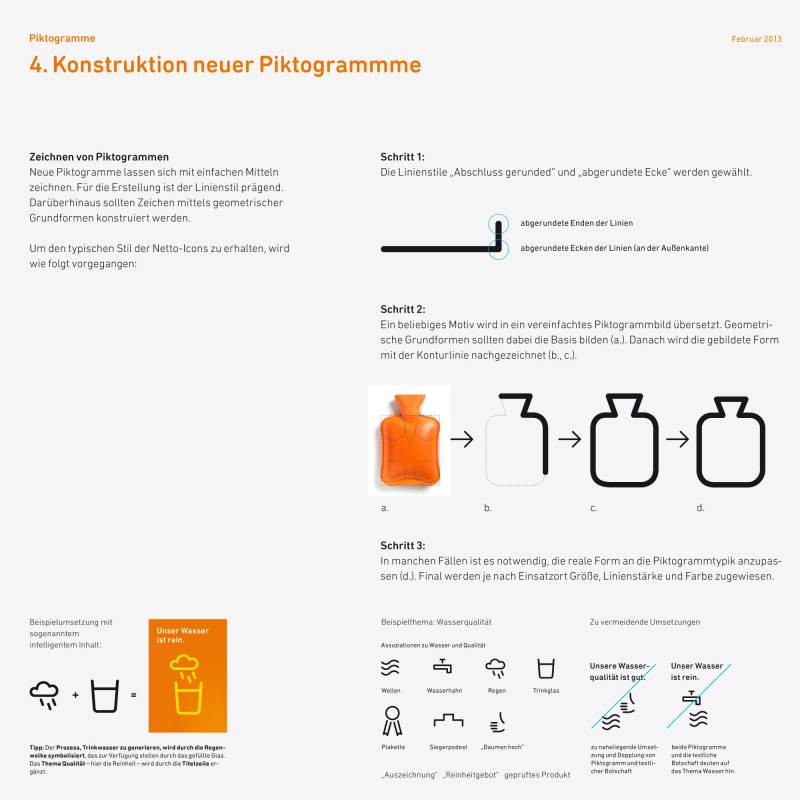
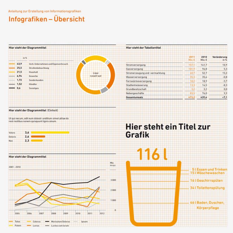
→ Pictograms: at the center of the appearance so that complex and abstract energy topics can be presented in an understandable and friendly way
→ Font: former Din is replaced with the less technical and more friendly Din Rounded
→ Color: one main energizing Orange accompanied by a bright white and yellow
→ Addional design element: the so-called energy impulse, brings an additional impression of energy to the orange colored areas
→ Images: pick up on the living environment of the people of Aachen
→ Logo: was to remain for various reasons; however, the form was slightly optimized
stawag.de


Made
. Design Team Lead
. Design Idea (together with a team)
. Design System
. Styleguides
. Iconography
. Infographics
. Print Media Concept
. Annual Report Concept
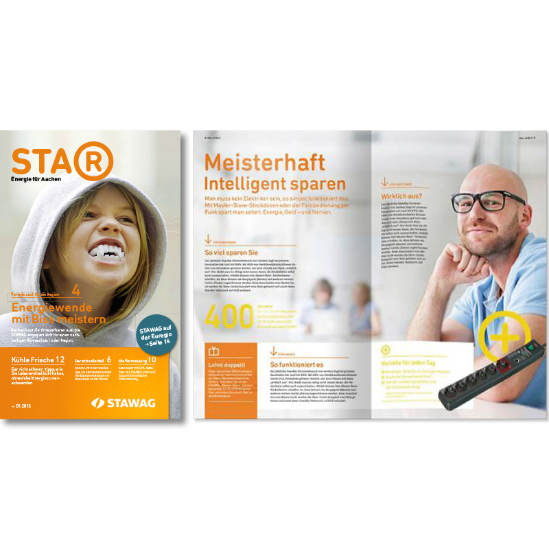
. Magazine Concept (customer magazine STA®, awarded with the Fox Designaward Gold)
. Launch Media (including employee poster campaign, presentation, making-off film and other media)
. almost all presentations for the client
. and much more
For MetaDesign . Rebrand . 2011/12
Photos
Thanks ♥ to the unsplash photographers Damian Barczak, Jeff Dunham, Karolina Nichitin, Kelly Sikkema, Randy Lisciarelli.