It’s easy . 2014


Ease.
This is a small glimpse of an artwork that didn't see the light of day. This is the reason why the name is displayed as Ease.
The artwork was created in 2014. During the project development this shown symbol was only a tiny part of a large number of logo symbol designs. Unfortunately it was never selected to be published. In my opinion, the sign had potential for this customer project. So I gave life to it to see if it works.
Tasks
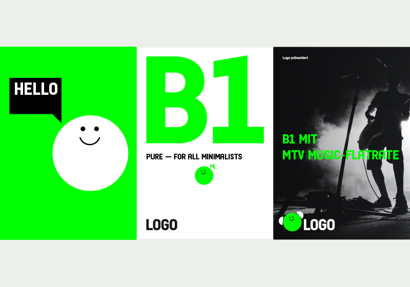
Creation of a new brand experience for a telecommunication provider that matches the new positioning.
The key points were:
. Simple tariff structure
. Low prices
. For everyone.


It’s easy.
Design idea
Everything is easy with a smart and friendly guide, narrator, and companion at your side.
Brand codes
→ Design elements: all as simple and clear as possible with a fresh and vivid overall look & feel
→ Colors: the inherited color green becomes brighter and more contemporary, accompanied only by black and white.
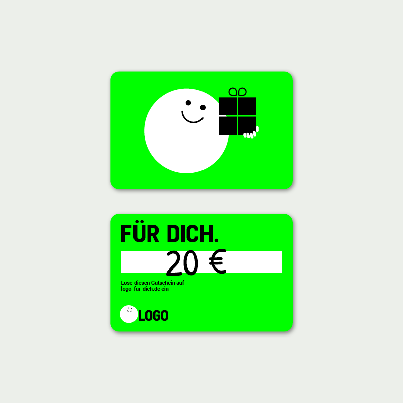
→ Images convey situations of ease
→ The companion: A friendly character that interacts with the user.


Made
. Everything
My project . 2014
Photos
Thanks ♥ to the unsplash photographers Daniel Robert Dinu, Emmanuel Ikwuegbu, Johnny McClung, Francisco Moreno, Ron Smith. Sorry, I have not found the photographer of the Eero Aarnio ball chair picture. Please contact me if you understandably claim rights.