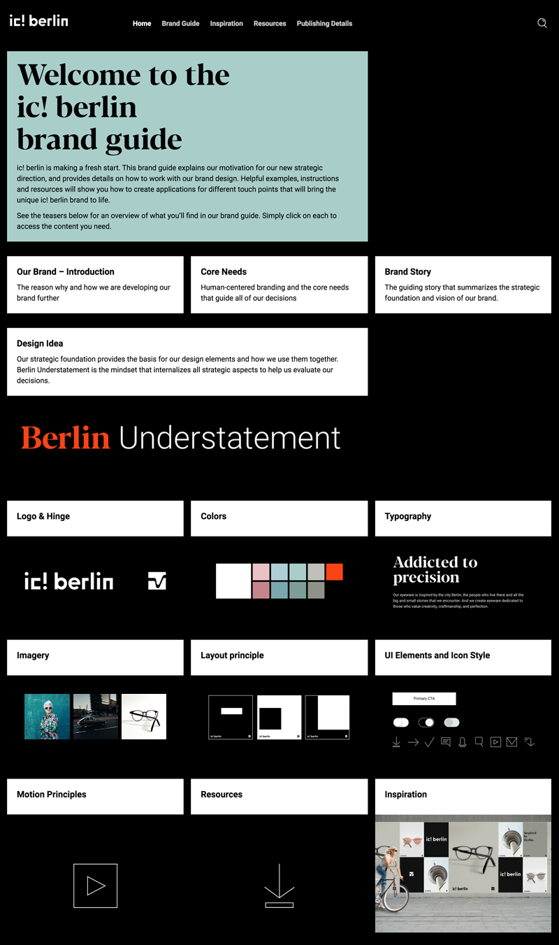
Berlin Understatement . 2018/19


ic! berlin
Founded in 1996, ic! berlin manufactures high-quality screwless eyewear in its own production in Berlin and by Berlin based people. The eyewear with the characteristic screwless hinge is present in 60 countries worldwide.
Tasks
With the change in ownership, the brand experience should be sharpened. The following goals were defined: Create
. a clear brand
. a clearer visual differentiation from the competition
. a brand experience that also appeals to the B2C market besides the B2B one.
. an overall high quality experience


Berlin Understatement
Design idea
Berlin Understatement
Brand codes
→ Logo: represents the rough, bulky and bold side of Berlin
→ Hinge: represents the high precision of the products
→ Colors: black is primary color (distinctive code compared to main competitors)
Option for tonalities for series of eyewear collections, special topics or messages, etc.
Option 1: additonal subtle Berlin color spectrum of concrete, cobblestone, Plattenbau, Wilhelminian architecture, tiles of subway stations, winter sky
Option 2: additonal bold and vibrant orange
→ Typography: Striking on display level, clearly restrained in the content area
→ Imagery: Products, accompanied by pictures of Berlin's vivid life but also quiet, unobtrusive micro-moments
→ Tone of voice: playful, intelligent, always approachable and sometimes suprising
→ Overall impression: Understated premium, dedicated to those who appreciate individuality with rough, edgy and bulky appearance and yet at the same time sensitive
ic-berlin.de


Made
. Pitch-Design (together ♥ with a wonderful team; special thanks ♥ to Alisa Hellwege) . Direction . Design System . Suggestions for different media applications . UI-Concept . Styleguide
For Deloitte Digital . Rebrand . 2018/19
Thanks ♥ to Manuel Schwedt who did the motion principles and icons.
Photos
Thanks ♥ to: Clem Onojeghuo, Marco Lastella, Morgana Bartolomei, Paul Volkmer, Pavel Nekoranec, and Newspaper Mockup by Pune Design.