Livisto . 2016

Livisto | New Brand
Since the founding of the original veterinary companies and the resulting aniMedica GmbH, and later the acquisition of various companies, the group has comprised a large number of brands in an increasingly consolidated market environment. The new LIVISTO Company brings together companies specializing in the field of veterinary medicine under one roof. It combines the company's tradition with the future-oriented present.
Tasks
The creation of a new, appropriate brand is required, taking into account the new supporting claim. The claim shows the attitude to enable animals to live a good life and to support all involved people in the best possible way.

Design idea
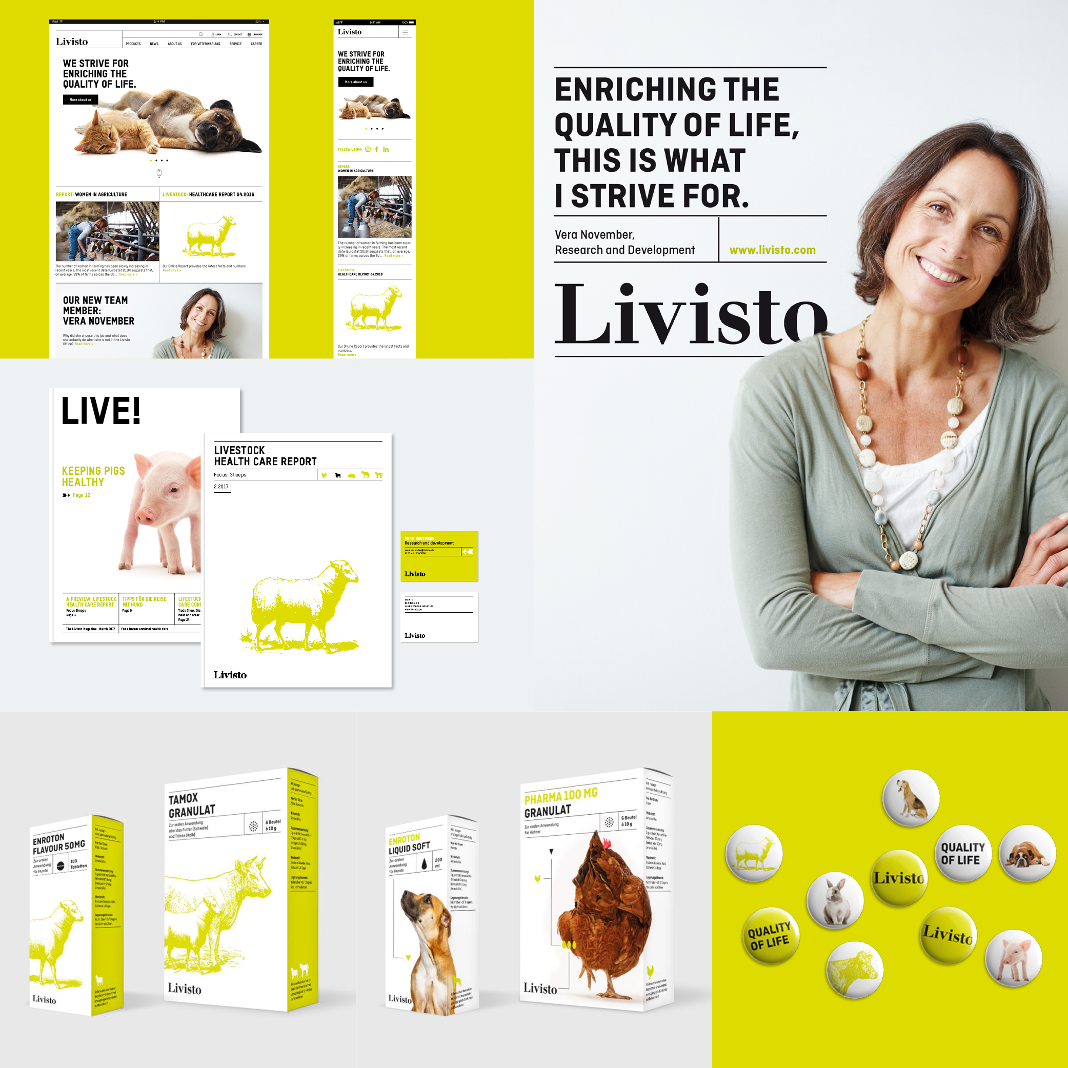
Combining tradition and modernity to enrich the quality of life
Brand codes
→ The tradition: the logo type, the illustration style, the colors black and white as well as the grid
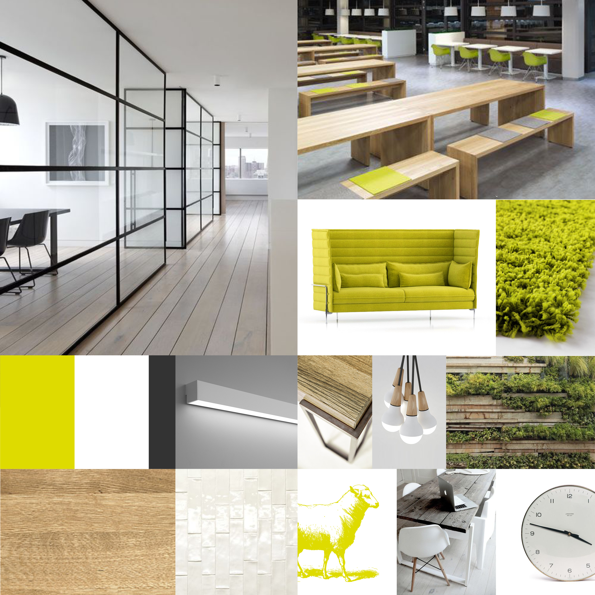
→ The contemporary: the vibrant, fresh greenphotography and the geometrical, clear typeface
→ Images: cut out images of „happy“ animals for the product world and authentic portraits or situations for editorials
→ Iconography: clear and simple
→ Overall impression: clinically and empathetically at the same time
Designconcept:

Made
. Design direction
. This idea and all designs for the concept presentation as (partly) shown here.
. The basic idea of the final brand design:
livisto.com
The packagings of the shown idea were done together with ♥ Astrid Schröder.
For MetaDesign, 2016
Photos
Pictures are licensed by iStock and alamy. All applied photos were only part of the concept presentation. And thanks to:
Judith Prins, unsplash.
If someone reclaims rights, please contact me.