Targobank . 2018
Targobank | Rebranding
Originally founded as a customer credit bank in Düsseldorf, Targobank is now part of the French cooperative bank Crédit Mutuel Alliance Fédérale.
Tasks
With the new positioning, Targobank wants to move from being a credit provider to an active supporter for the customers’ desires and show it.
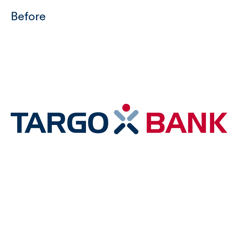
Before:
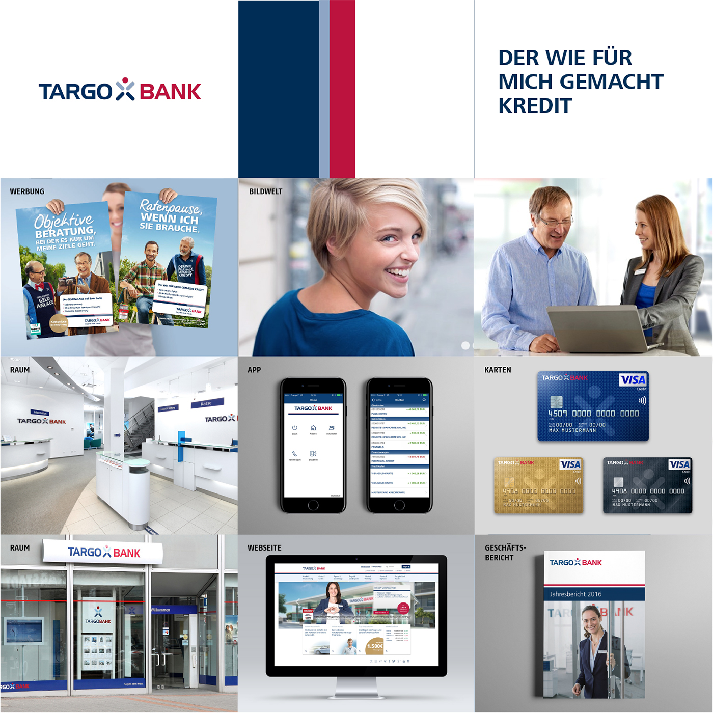
Design idea
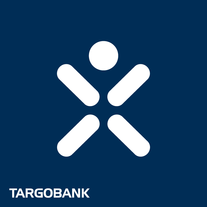
From the so-called Targobank Männchen ("little man"/manikin) to the human being in focus!
Brand codes
→ Logo: The symbol is removed from the logo and becomes the distinctive sign: the human being. The word mark remains the stable sender.
→ Colors: The dark blue remains as primary color, while the two accent colors becoming brighter and more active.
→ Font: Bolder, clear and confident
→ Typography: For core messages, the colors play with the communicative parts of service/product (light blue) and customer desires (red).
→ Imagery: Close to the customers world and their desires, authentic, colorful, fresh and "warm" at the same time
→ Layout principle: Composed of as few, clear elements as possible
Designconcept:

Made
. This idea
. Everything regarding this idea for the concept presentation as (partly) shown here
This idea was selected. Finally, not all brand codes were implemented.
targobank.de
For MetaDesign, 2018
Photos
Pictures are licensed by iStock. All applied photos were only part of the concept presentation.
If someone reclaims rights, please contact me.