My project . Expanding horizons . 2010

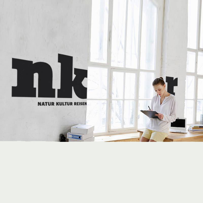
nkr
The German travel provider offers nature and culture tours for people who love travelling with an educational character in small groups. After three decades the overall look and communication had become outdated and following a generational change the company was ready for the next step. The acronym nkr stands for Natur (nature), Kultur (culture) and Reisen (travel).
Tasks
In addition to the content-related and strategic reorientation, the overall appearance was to be made future-oriented and attractive for new target groups.


Expanding horizons
A project from my graveyard of ideas. Unfortunately, this idea did not make it into the selection for the client presentation. But because I was convinced of the idea, I devised it for myself. I did this more than 15 years ago and I still love the idea.
A note: skr stands for Studienkontaktreisen (study and contact trips). Since the age of parship, tinder, bumble & co, this name is misleading. Therefore, from my point of view, a change to nkr (Natur/nature Kultur/culture Reisen/travel) would had make sense.
Design idea
Expanding horizons
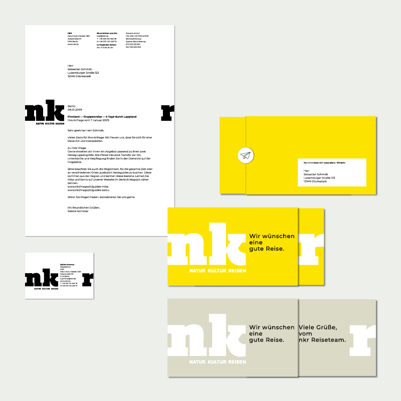
Brand codes
→ Logo: This is the prominent element. The space between the logo letters “n” and “k” (the offers Natur/nature and Kultur/culture) and “r” (Reisen/travel itself) is the place for narratives like travel experiences, special moments, for texts and other relevant content. Sometimes it is simply the view from the workspace that makes the mind travel.
→ Font: a clear font that contrasts with the striking typography of the logo
→ Colors: neutral black for the company, bright yellow and muted sand tones for the two main types of travel experiences
→ Imagery: authentic, inspiring, showing travelers on their journey
→ Tone of voice: inspiring and approachable


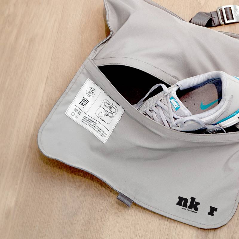


Made
. Everything
In addition:
. Design ideas for the new brand experience SKR.
. For the finally implemented corporate design: complete revision of the travel catalog (overall content structure, page types, restructuring of the travel pages, icons, micro typography)
skr.de
My project . 2010
Photos
Thanks to: Arne Smith, Boxed Water, Cosmin Georgian, Daisy Chen, Fabrizio Chiagano, Felix Fuchs, Jacob Jolibois, Jakub Dziubak, Jason Hogan, Jonathan Gallegos, Joshua Fuller, Long Ma, Louie Martinez, Lucas Ludwig, Marco Zuppone, Michael Henry, Michal Pechardo, Millie Greaves, Motoki Tonn, Moujib Aghrout, Peggy Anke, Redd, Rena, Ryoji Iwata, Tim Gouw, Victoriano Izquierdo, Walter Mario Stein, Yukiya Shiba. If I forgot a name, please contact me if you understandably claim rights.